The Medica Zone
A year inside a student-run nonprofit's graphics team: 60-plus assets, a brand refresh, and the guidelines that keep forty volunteers making the same brand.

The Medica Zone started in 2020 as one high-school student's idea and grew into a network of 6,000 members run by about forty directors, interns, and coordinators. Almost none of them are designers. The brand had to work in their hands, not only in mine.
I joined the graphics team remotely for a year. The job was two things at once: keep a steady flow of social and event graphics going out every week, and help rebuild the visual system underneath them so the next intern would inherit rules instead of a folder of one-offs.
Social and event graphics
Most of the sixty-plus pieces were built for small screens, read for two seconds, and gone.
So the rules were about restraint. Copy held to eight or ten words. Textless mark unless the name wasn't already in the post. Brand colours by default, with room for holidays and events. Typography, grid, and hierarchy stayed constant so the feed read as one voice even when four people were posting.
Animated versions carried the same system into motion, a short reveal on the headline with the mark settling last, so a static and an animated post from the same week were unmistakably siblings.
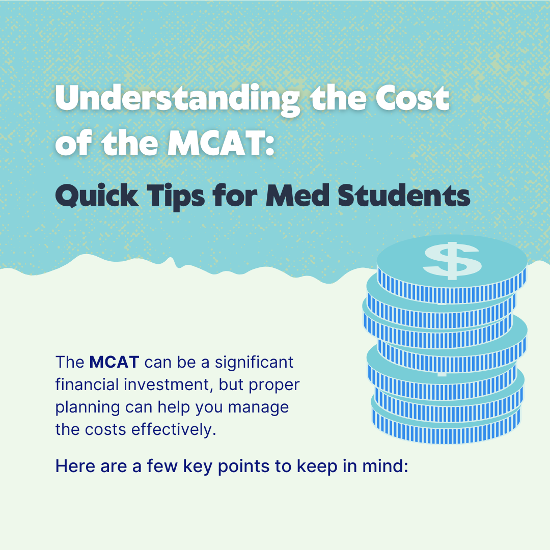
Understanding the cost of the MCAT
Cover of a tips carousel. Aqua Remedy and Morning Light, a torn-paper edge, and a stack of coins so the subject reads before the headline does. The kind of post people save, which is what the algorithm rewards.
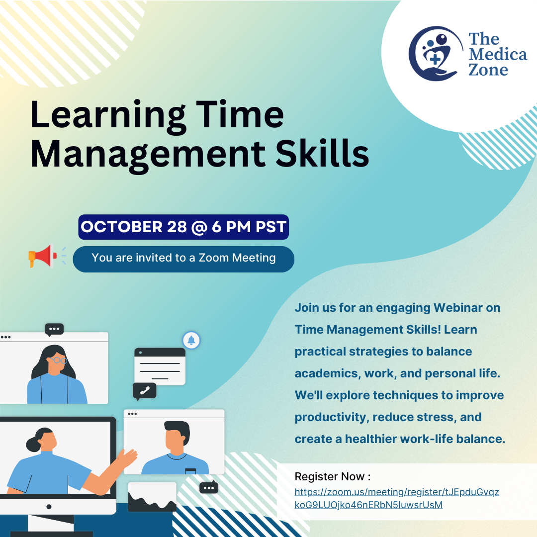
Time management webinar
Event post for a Zoom session. Date and invitation pulled into two pills so they scan first, the horizontal logo top right, and illustration of a video call so nobody has to read to know what it is.
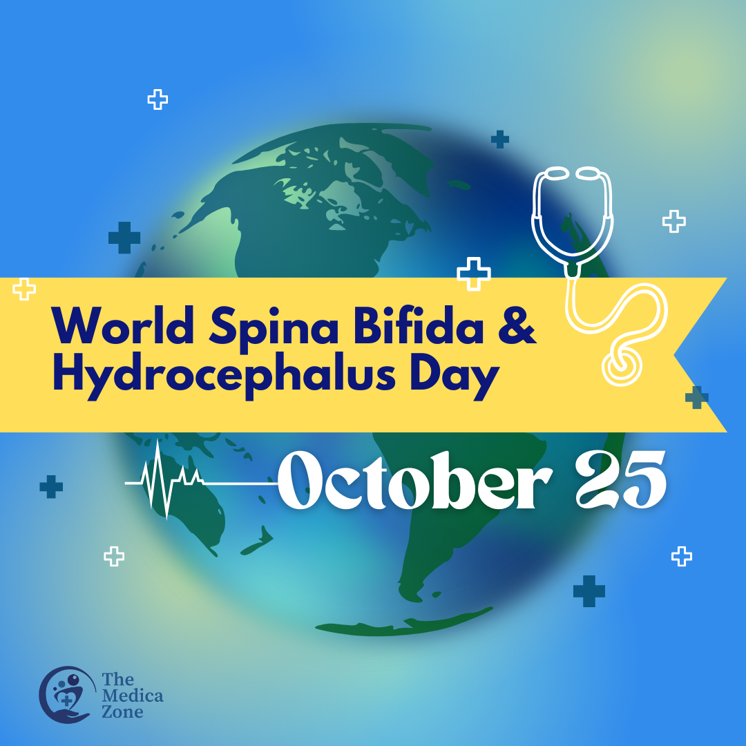
World Spina Bifida and Hydrocephalus Day
Awareness-day post, one of a running series. A globe, a Golden Dawn ribbon, the stethoscope from the icon pack, and the textless mark small in the corner. Holidays and observances are where the palette gets to stretch.

Behind the Scrubs: a nurse’s journey
Speaker event post. The curved headline follows a dashed path to a map pin, so the idea of a journey reads at a glance. Photo, date, time and a “Link in bio” button sit in a clear order underneath.
Rules a volunteer can follow at 11 pm
I worked with the graphics team on the refresh and contributed to the Brand Style Guidelines that came out of it: logo variations and misuse rules, a named eight-colour palette, font pairings including a Canva-safe one, the icon pack, social and photography guidance, and business card applications. The guide itself belongs to The Medica Zone. What follows is the part I made.
A hand holding a heart, a cross, and three rising circles, in Resilient Navy and Medica Blue. Three variations: mark only for social, horizontal for anything that needs the full name, vertical where the horizontal is too wide. The rules that came with it: never rotate, never crop, keep it visible against whatever is behind it.



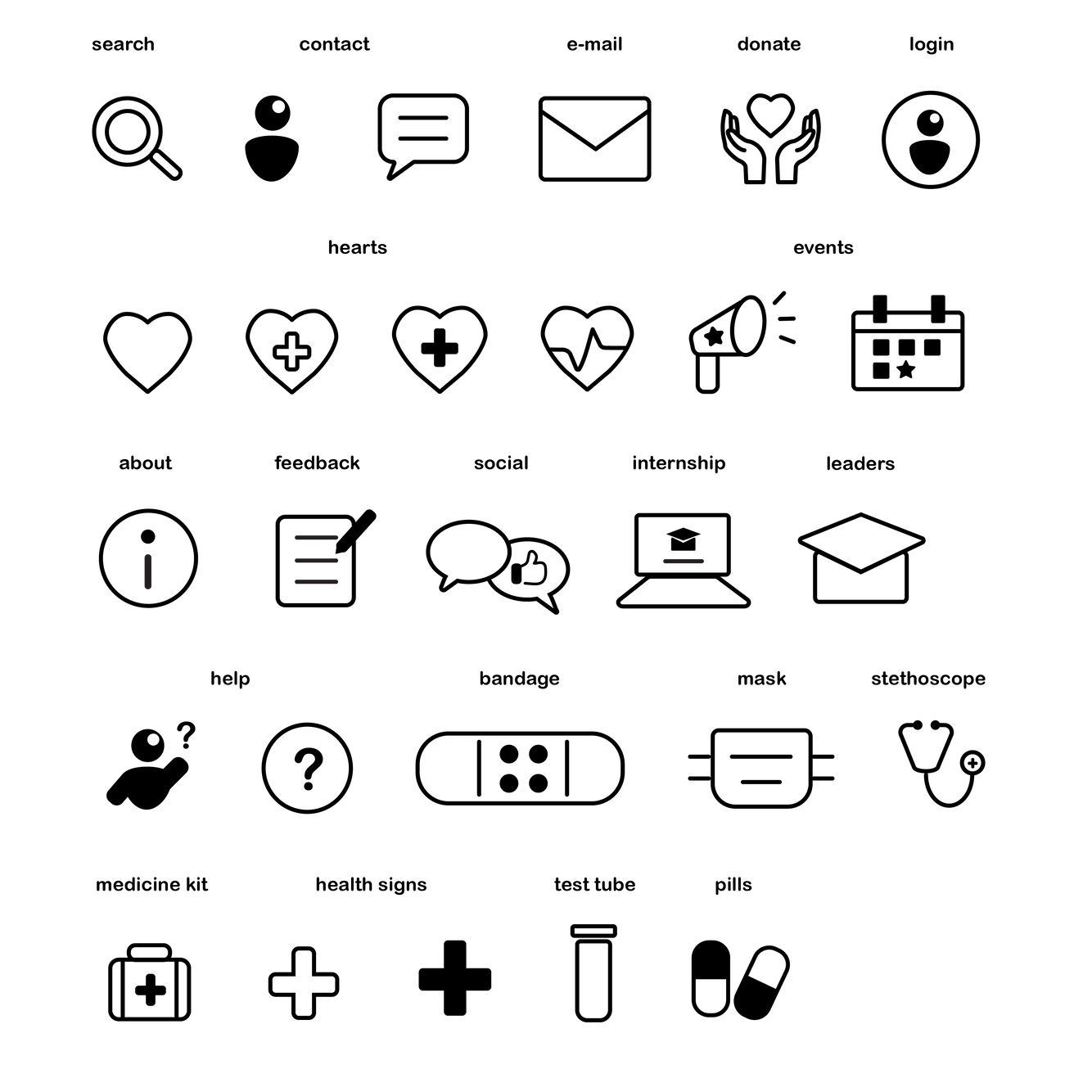
Twenty-seven icons built from shared core components, in a matched two-tone and line style, with people rendered as solid glyphs so they read first at small sizes. Consistent stroke, corner radius, and optical size across the pack so any two icons sit together without adjustment, whether on the website, a post, or a printed card.
#FFF5CE
#FEEAA1
#AED1AA
#78CDD7
#328CEC
#0C1779
#02030E
#FFFFFF
Chosen to read as reliable and fresh for a student-run medical organisation. Each colour got a name because "the light blue" causes arguments and "Aqua Remedy" doesn't.
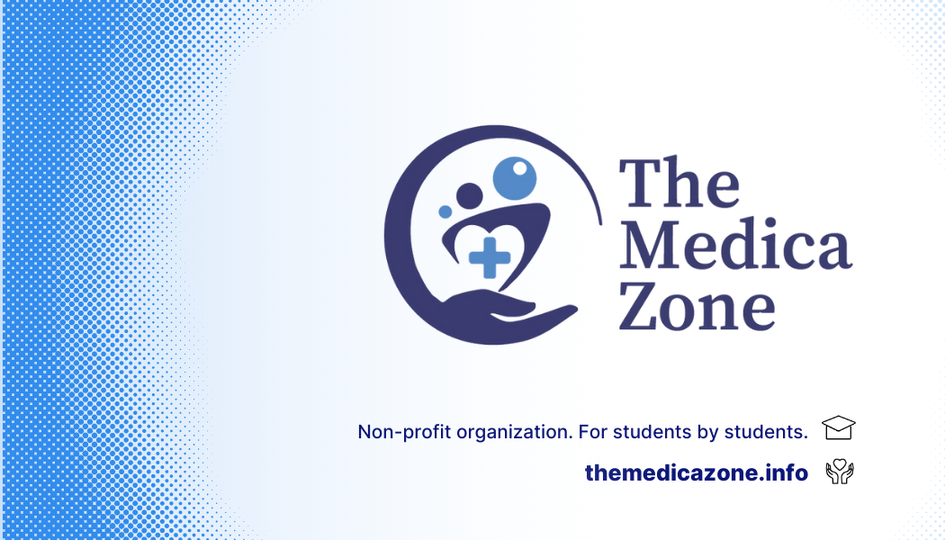
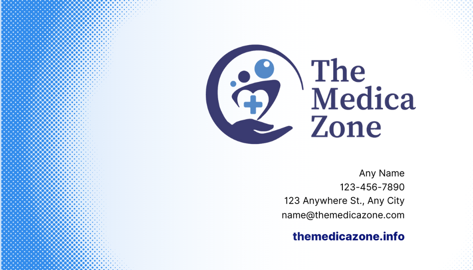
Both sides share a halftone fade in Medica Blue, the horizontal logo, and Inter for the details. Clean and balanced, and set up so a director could reorder from any print vendor and get the same card back.
Production, not just design
Request
Coordinators filed graphic requests through a shared doc: what, where, when, and the copy, trimmed to ten words before it reached me.
Build
Templates first, custom work second. Every post checked against the palette, the pairing, and the mark rules before it left my desk.
Review
Iterative rounds with the graphics lead and the requesting team. Feedback folded in without letting the system drift.
Deliver
Dimensions, resolution, and file format validated per platform (1080 square, 1080×1350, 1080×1920, LinkedIn 1584×396) and merch files prepared to the vendor spec.
I wrote the guidelines for designers and then handed them to people who aren't.
The guide is thorough, and it is also twenty-five pages. The coordinator building a post at 11 pm needs one page: the mark, three colours, one pairing, the ten-word rule. I'd ship that one-pager first and let the full document sit behind it for the people who want it. Adoption is the measure of a brand system, not completeness.