Enthuze
An energy drink for the people the category scares off — bubbly instead of aggressive, welcoming instead of extreme.
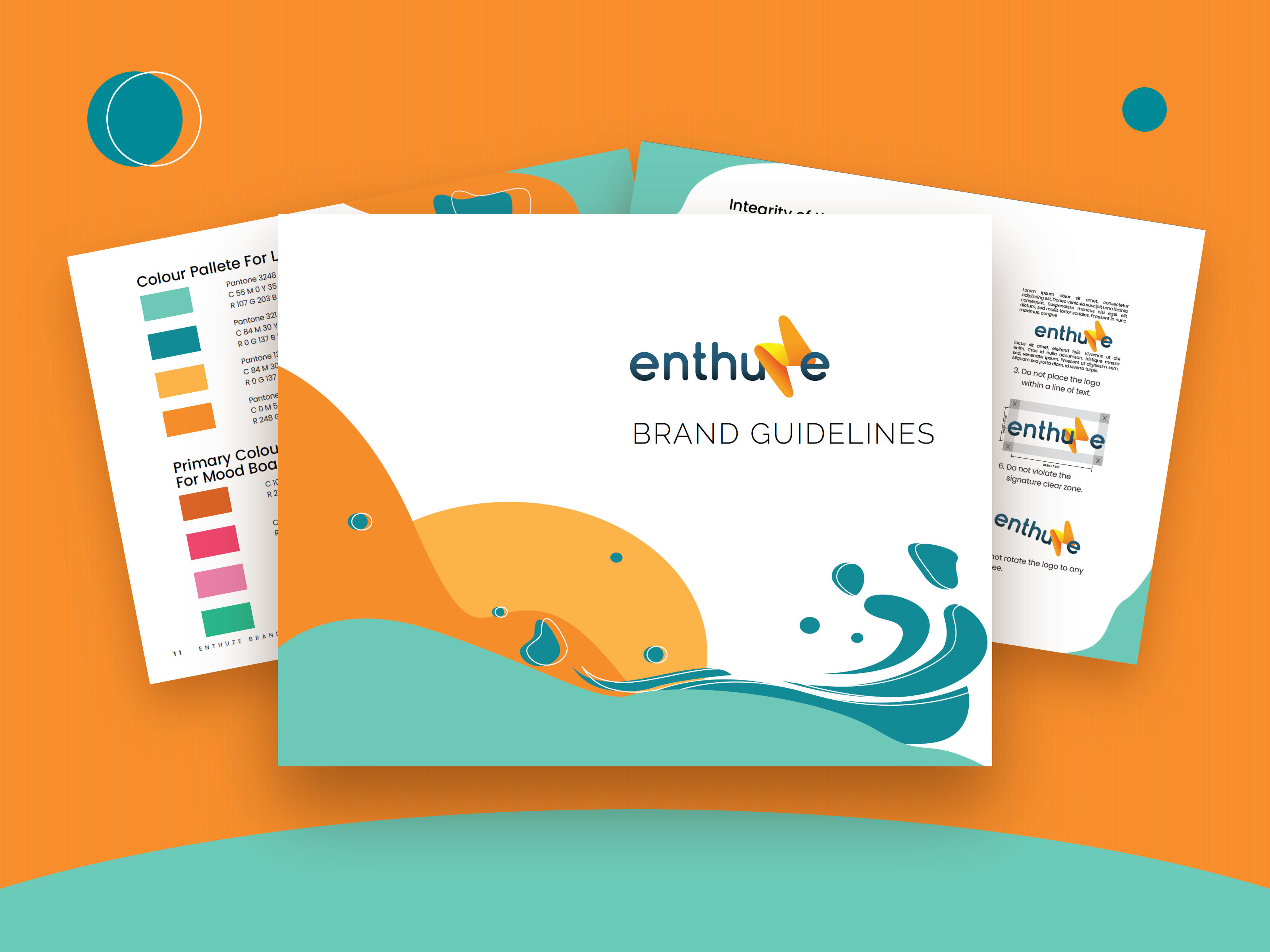
Energy drinks all shout. Enthuze is the one on the shelf that doesn't — a bubbly identity in a category built on intensity, aimed at the person who has never bought one and doesn't want to be dared into it.
It is for people new to energy drinks, and for anyone scanning the shelf for one that doesn't take itself so seriously.
Research & strategy
01 — the foundationA brand starts with knowing what you're actually making, and what it's worth to the person picking it up.
So the work began with competitors — their identities, their tics, the black cans and claw marks the whole category shares. Mapping what they have in common is what made difference possible: once you can see the culture around energy drinks clearly, you can see exactly who it shuts out.
Enthuze aims at those people — the ones who put the can back down because it looked like it was daring them.
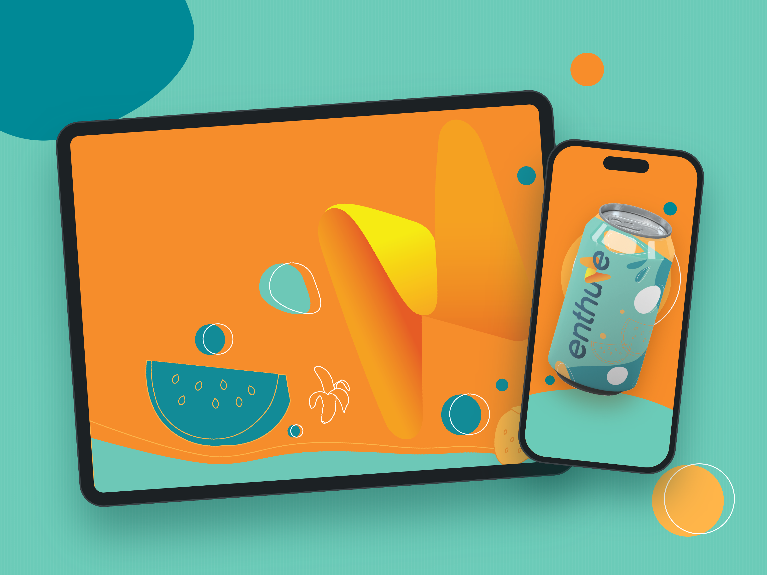
Before there was a logo, there was a feeling: a bubblegum bubble mid-pop, a face covered in glitter, laughing.
The mood board was how Enthuze found its personality before it had a name. I gathered images that felt like the opposite of the category: sliced oranges and blueberries, bananas on bright yellow, marigolds, liquid colour swirls, and anime illustration full of light and water. Nothing on it is black, and nothing looks like it's daring you.
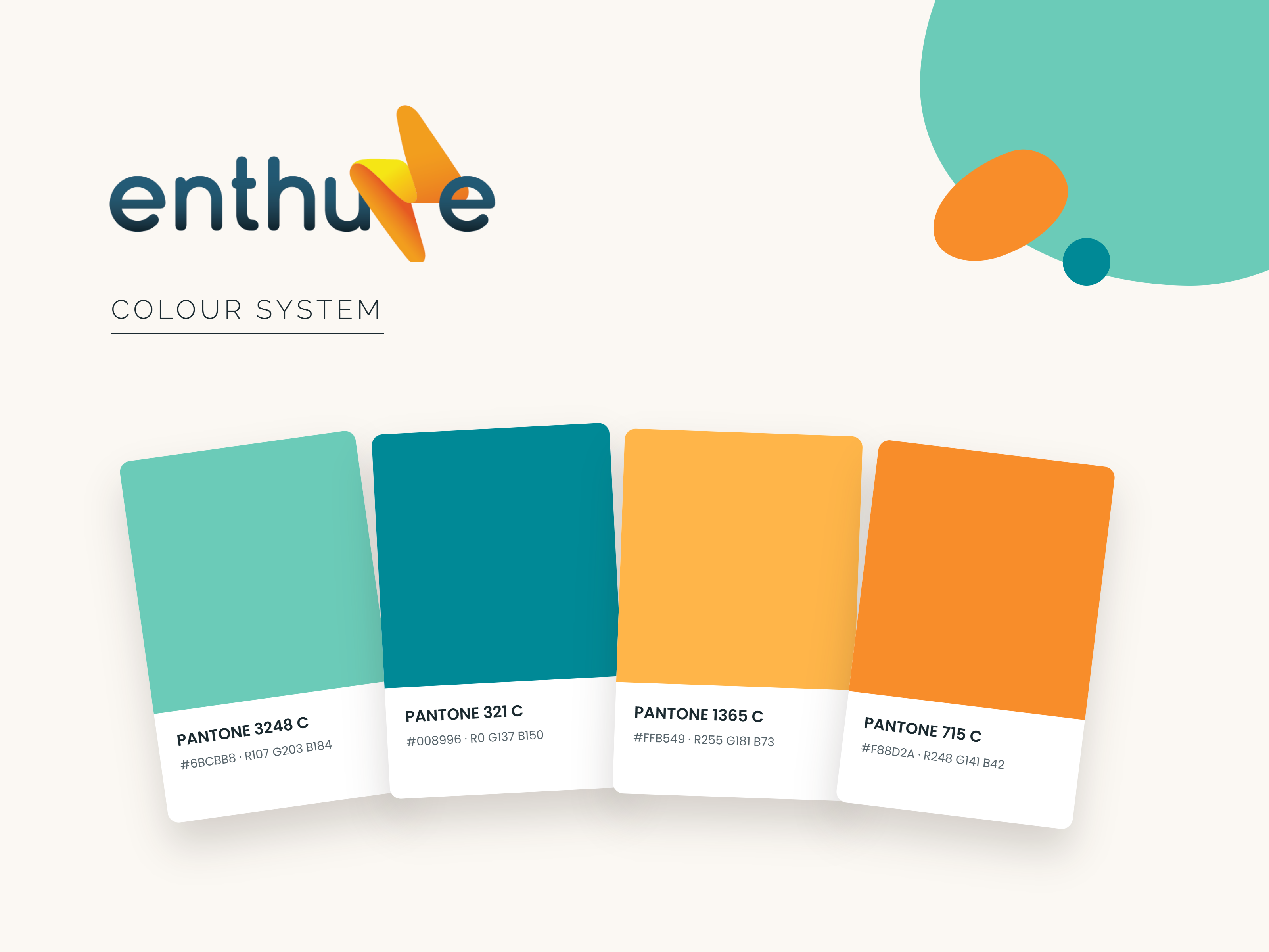
It did three jobs. The fruit set the palette, with mango, orange and teal pulled almost straight from the photos. The liquid swirls and bubbles became the organic blob shapes used across the guidelines. The laughing faces set the tone of voice: playful, a little silly, never extreme. Whenever a design choice was unclear, the question was simple: does this belong on the board?
Treat a brand like a person
An identity is easier to build once you know how it should behave. Finding Enthuze meant deciding what someone should feel in the two seconds between reaching for the can and reading the label.
Energetic
Bubbly
Entertaining
Bright
The name came straight out of those four traits and the word Enthusiasm — which is the whole product in one word.
The system
03 — guidelinesA brand only stays itself if the rules are written down before anyone else touches it.
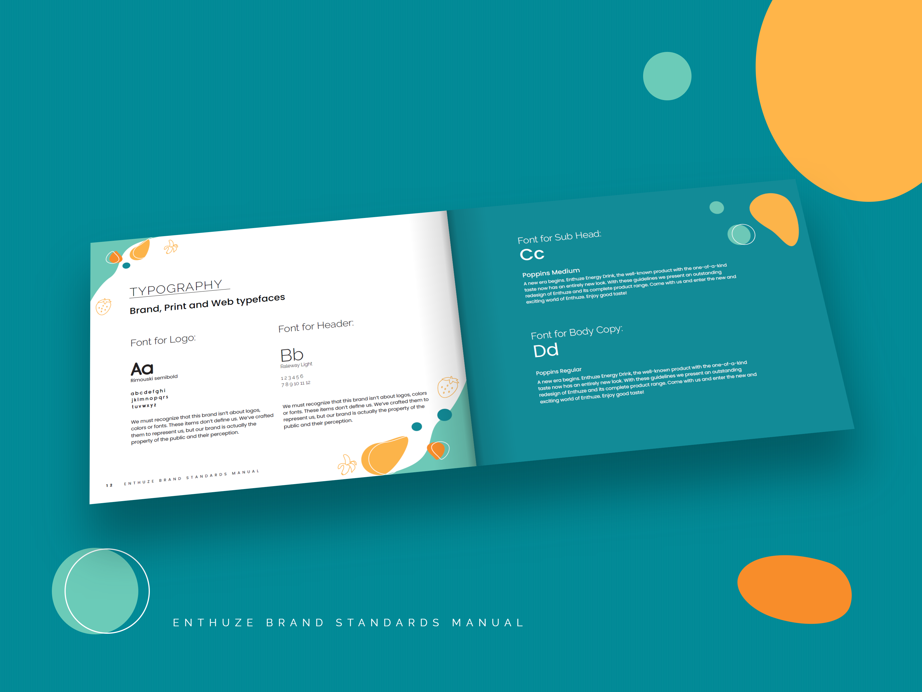
The guidelines cover the logo, the colour schemes, and the typography — down to the details that keep Enthuze looking like itself rather than the shelf around it.
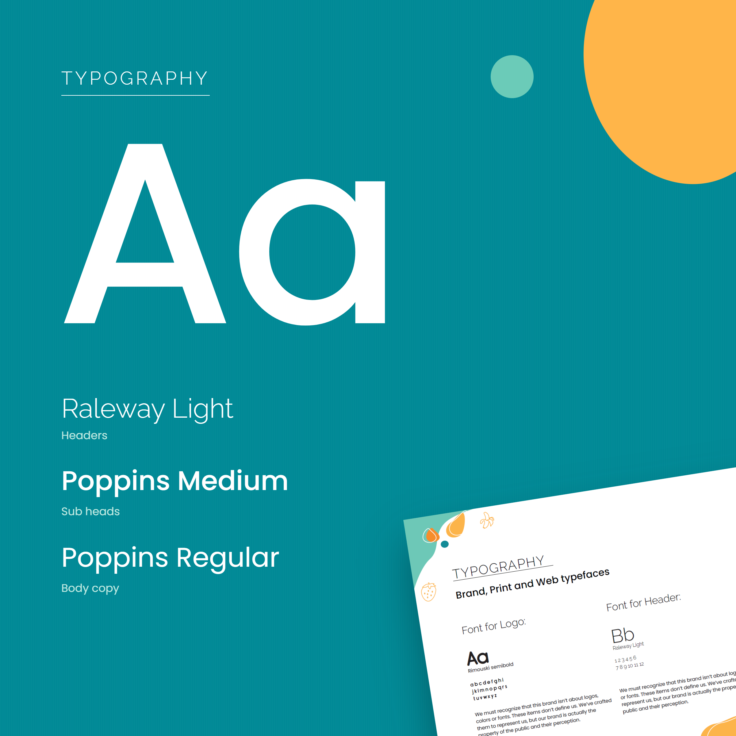
Round letterforms with an open feel. Nothing condensed, nothing that looks like it's shouting.
Raleway Light sets the headlines and gives them air. Poppins carries everything underneath: Medium for subheads, Regular for body copy, and its round geometry suits the bubbly logo. The logo has its own face, Rimouski Semibold, kept out of everyday use so the mark stays special.
The product in motion
A static can on a shelf has two seconds to earn a second look. A can that moves gets closer to ten.
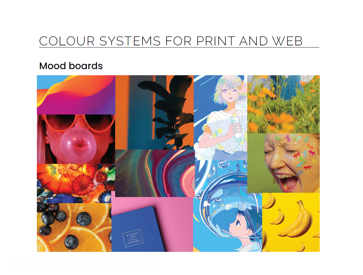
The product showcase animates the packaging and the brand's own visual elements so the identity behaves the same way in motion as it does in print: bubbly, bright, never aggressive. Modelled and rendered in 3D, composited and timed in After Effects, built for the feed and the pitch deck alike.
I chose the four brand traits before talking to a single person who avoids energy drinks.
The entire premise is that the category alienates people, and my research was competitor identities rather than those people. The identity holds up on its own terms, but "welcoming to newcomers" stayed an assumption I decorated instead of a finding I tested. Five conversations would have either sharpened it or killed it.