Money Heist
Funko Pop inspired character icons for La Casa de Papel — built on golden-ratio construction and documented like a real brand.
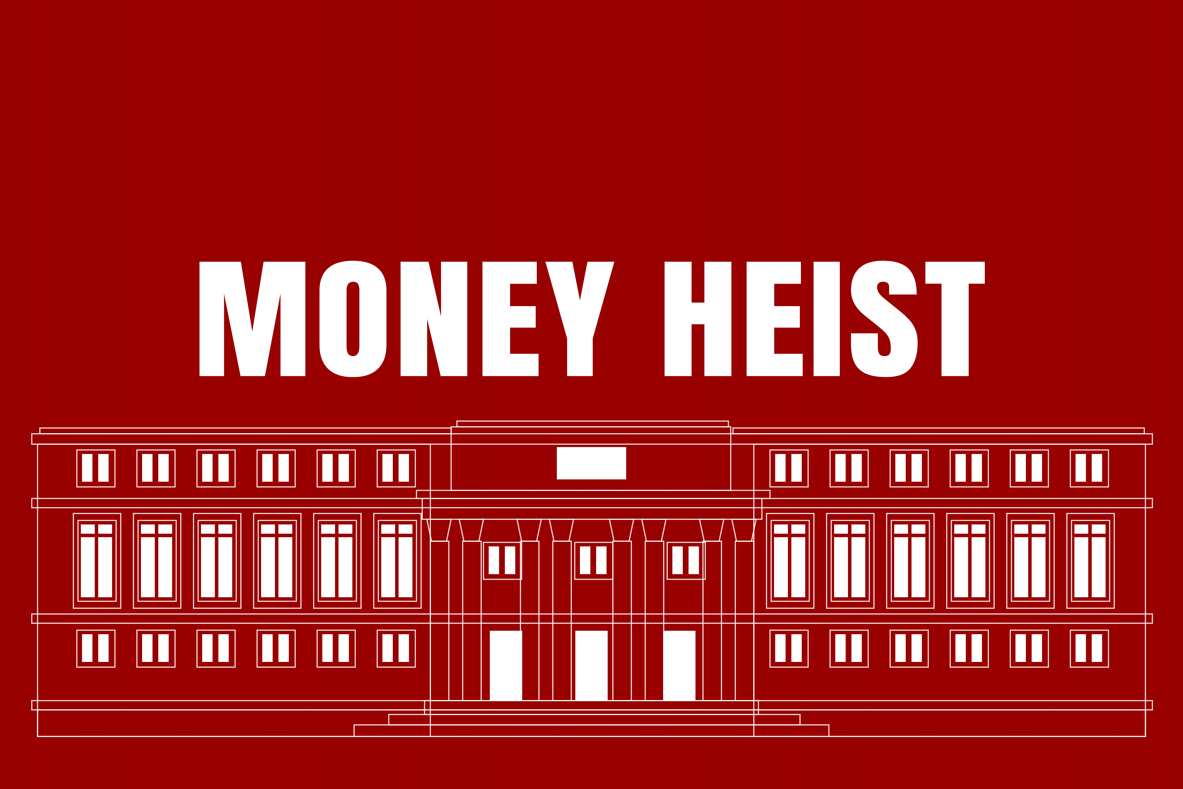
Money Heist — La Casa de Papel — arrived in 2017 and got popular enough to be merchandised, Funko Pops included. These icons borrow from both: the series, and the toy line that flattened it into something collectable.
The challenge is stylisation under constraint. Funko's proportions are unforgiving — miss them and the reference disappears. Hit them and a character survives on a jumpsuit and a jawline.
Research & concepts
01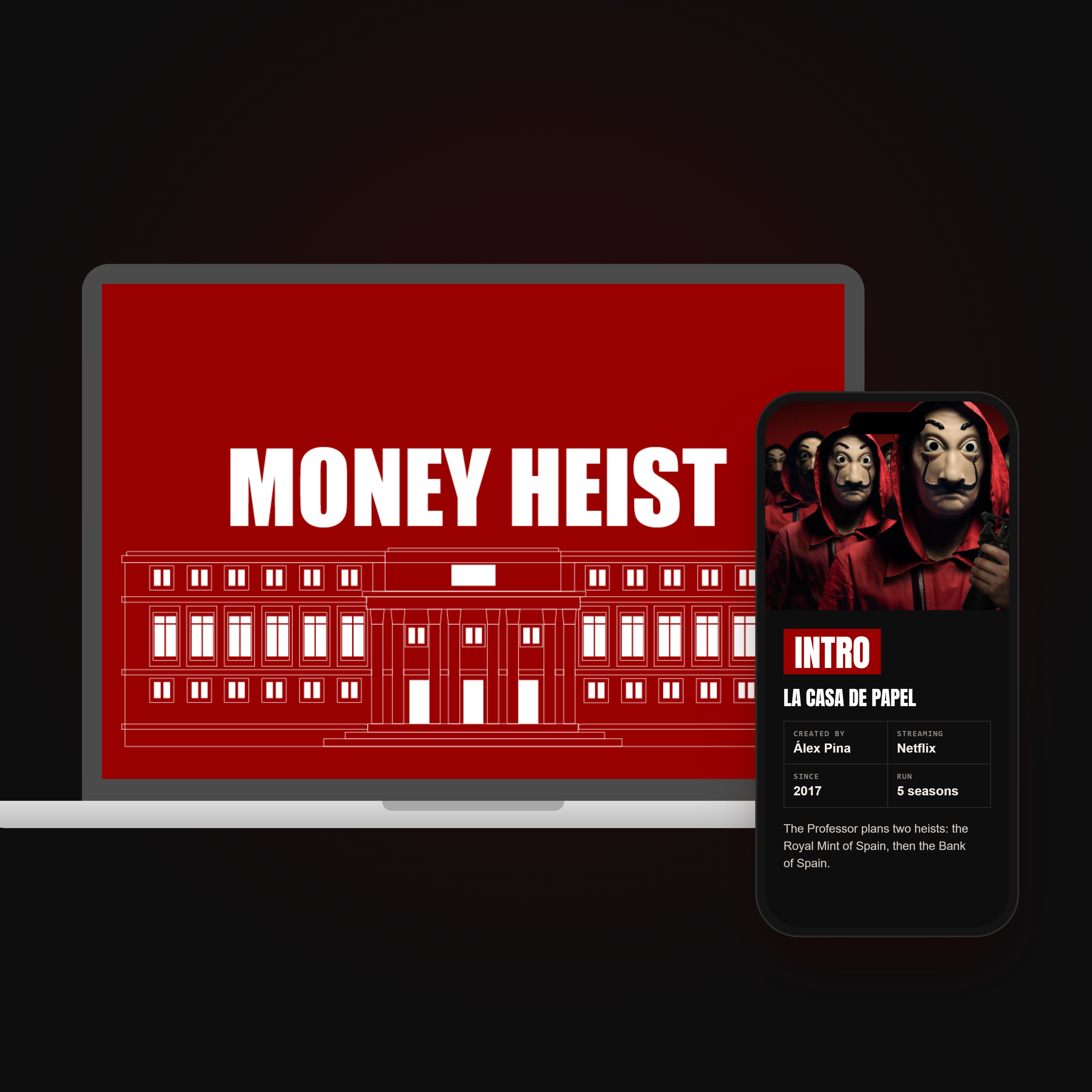
Study the source before touching a pen.
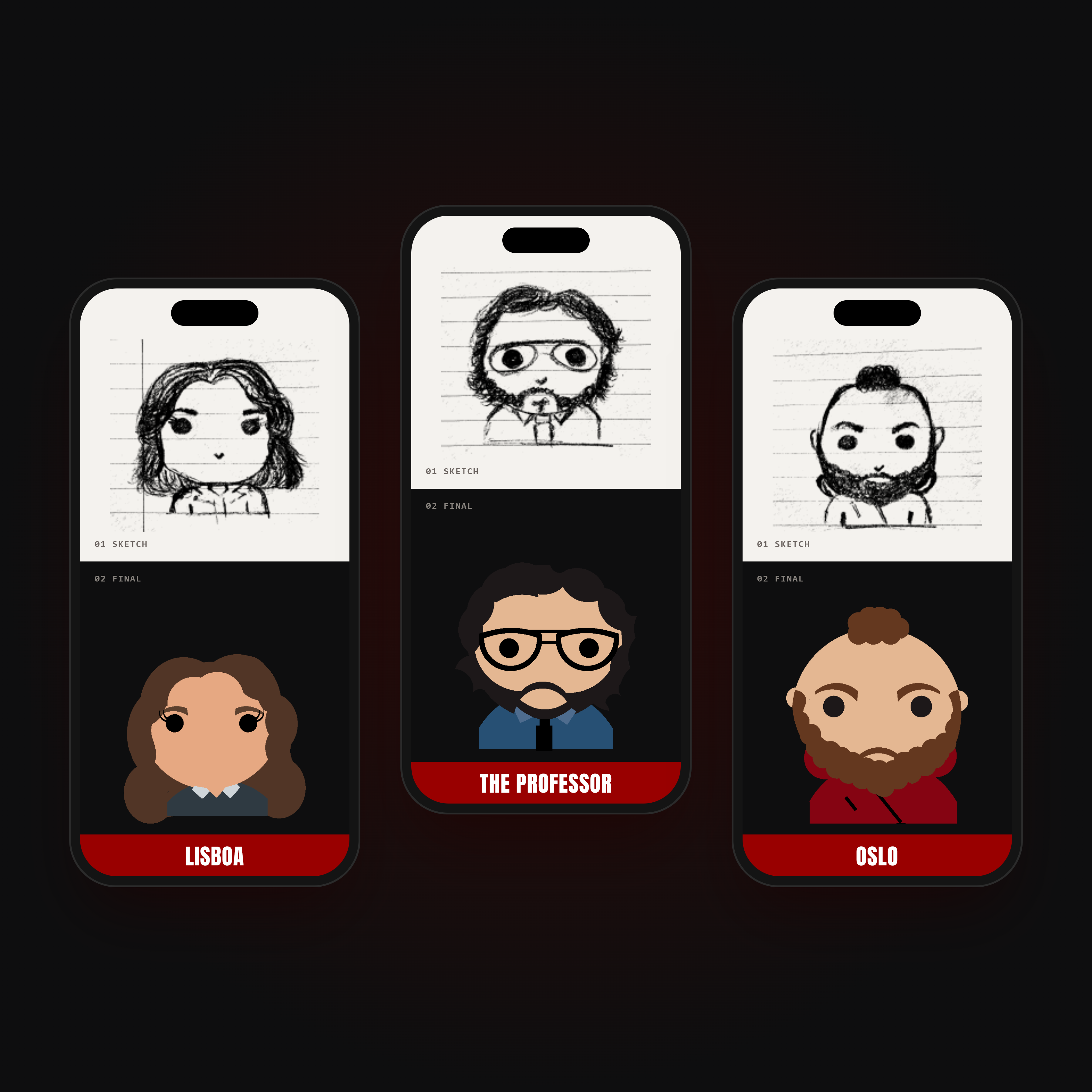
Reference gathering covered both halves — the characters as the series presents them, and the Funko system that had to hold them. What stays, what gets abstracted, and the one detail that still identifies each of them at 32 pixels.
Design
02 — implement and produceThe cute comes from maths.
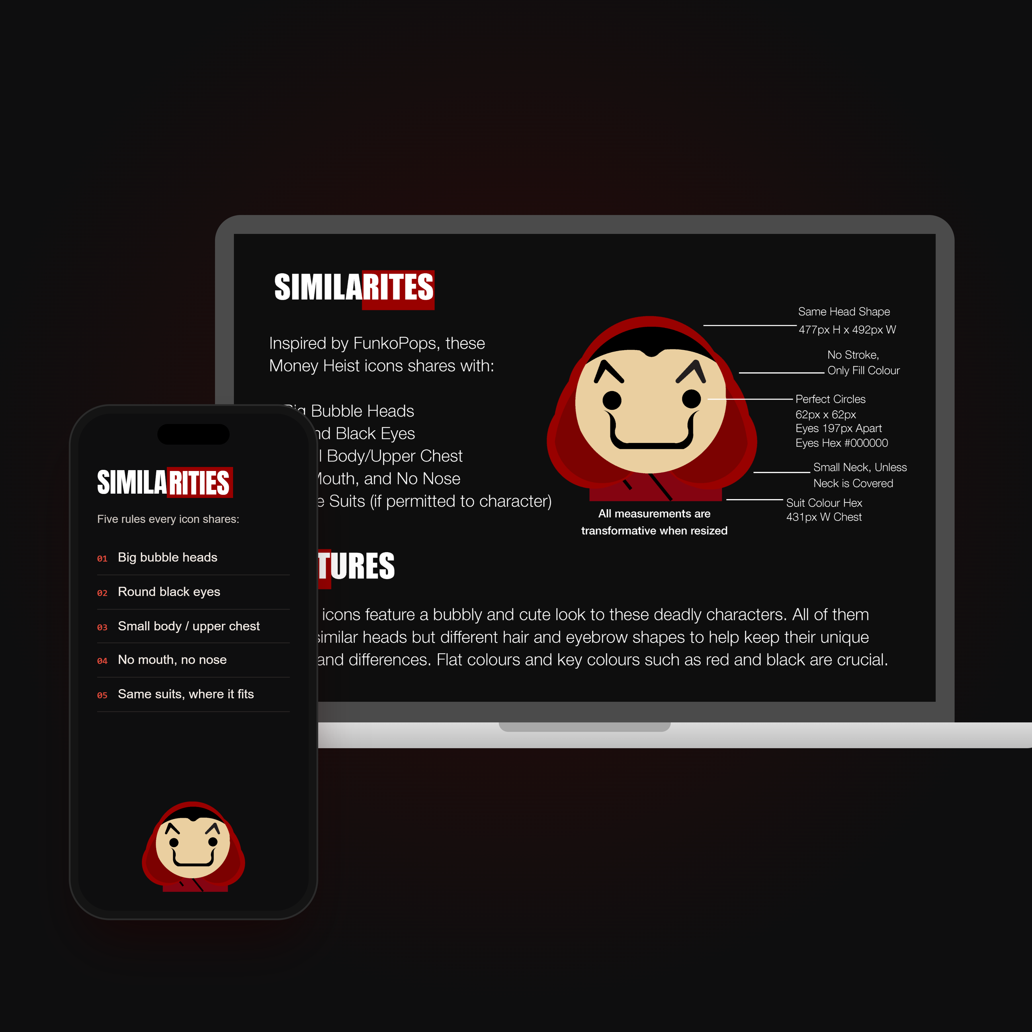
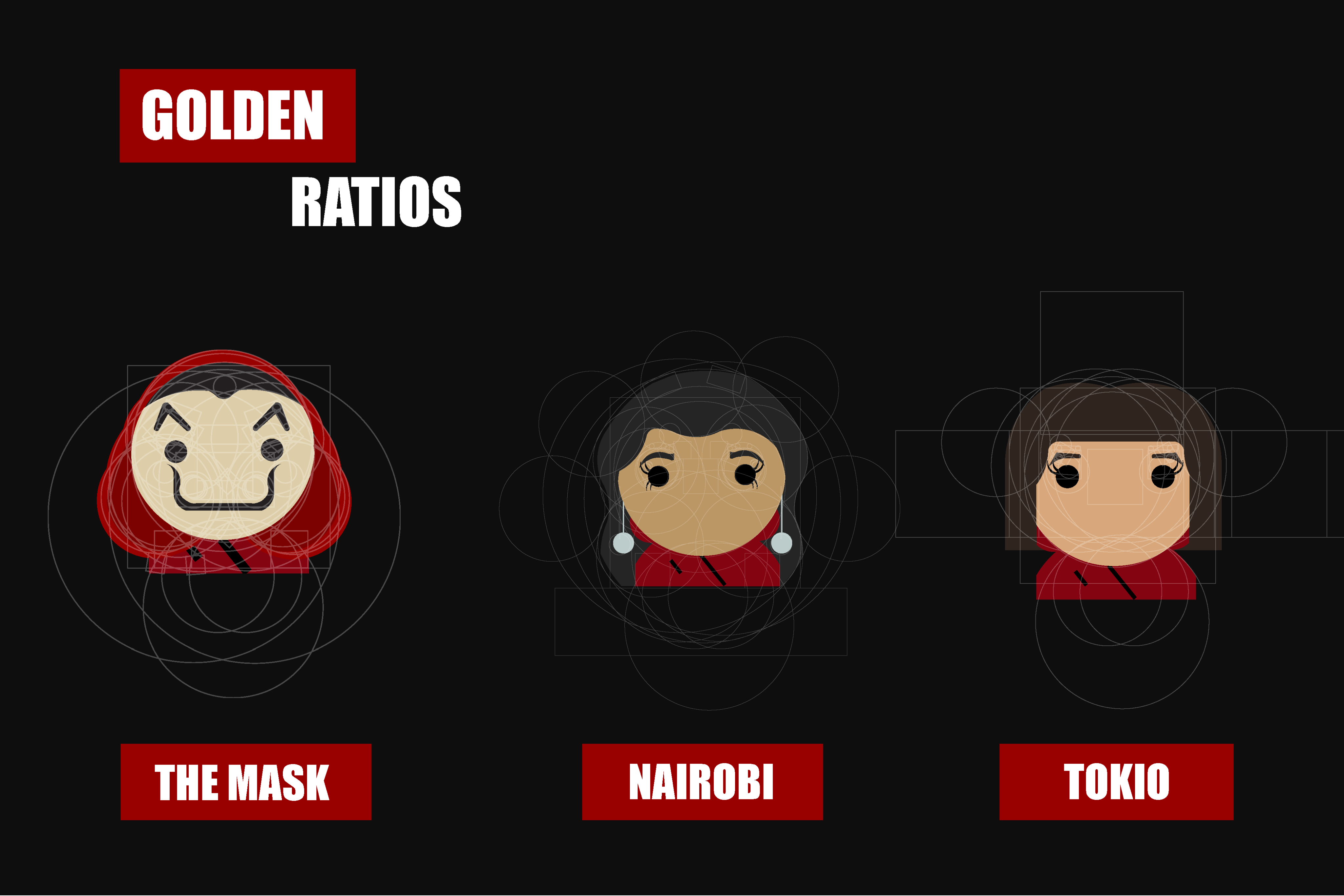
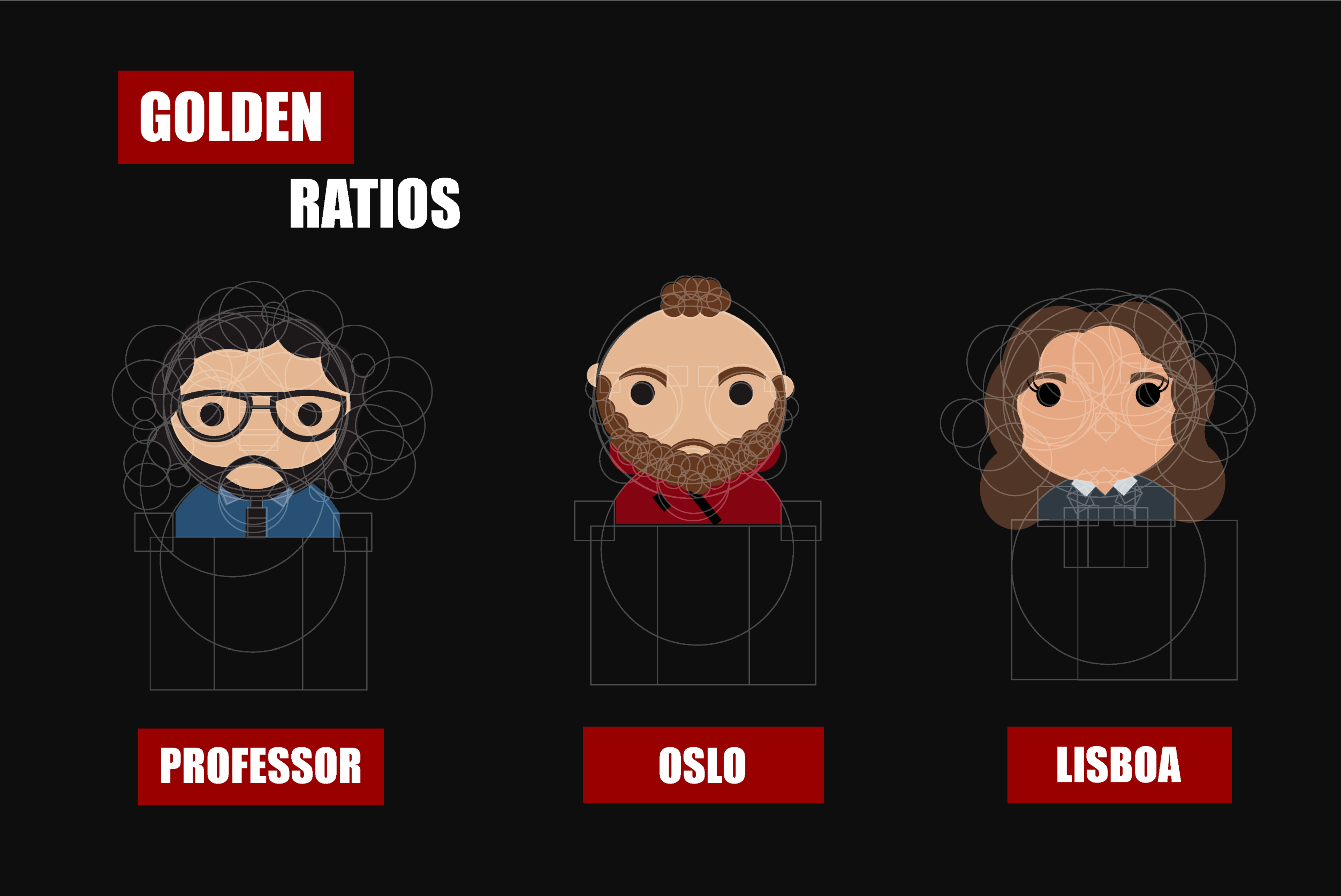
Each head starts as a set of golden-ratio circles and rectangles. The circles shape the skull, hair and hood, and the rectangles fix where the eyes, neck and shoulders sit. Because all six characters are built on the same proportions, the Mask, Nairobi, Tokio, the Professor, Oslo and Lisboa look like one family even with completely different hair, beards and glasses.
Every icon sits on the same construction grid, so the set holds together whether you see one or all eight. The golden ratio does the proportional work; the grid keeps the family resemblance.
The palette is the plot
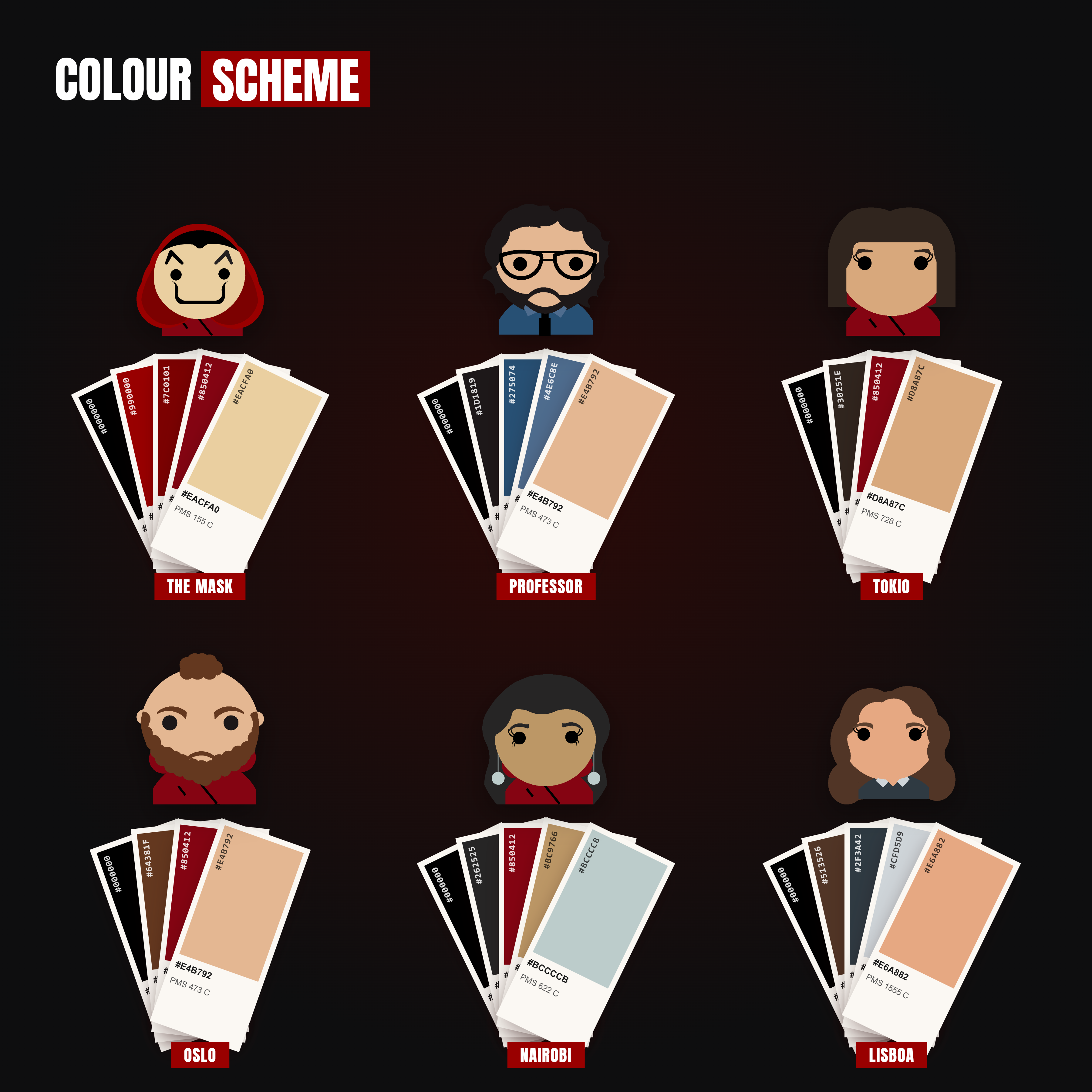
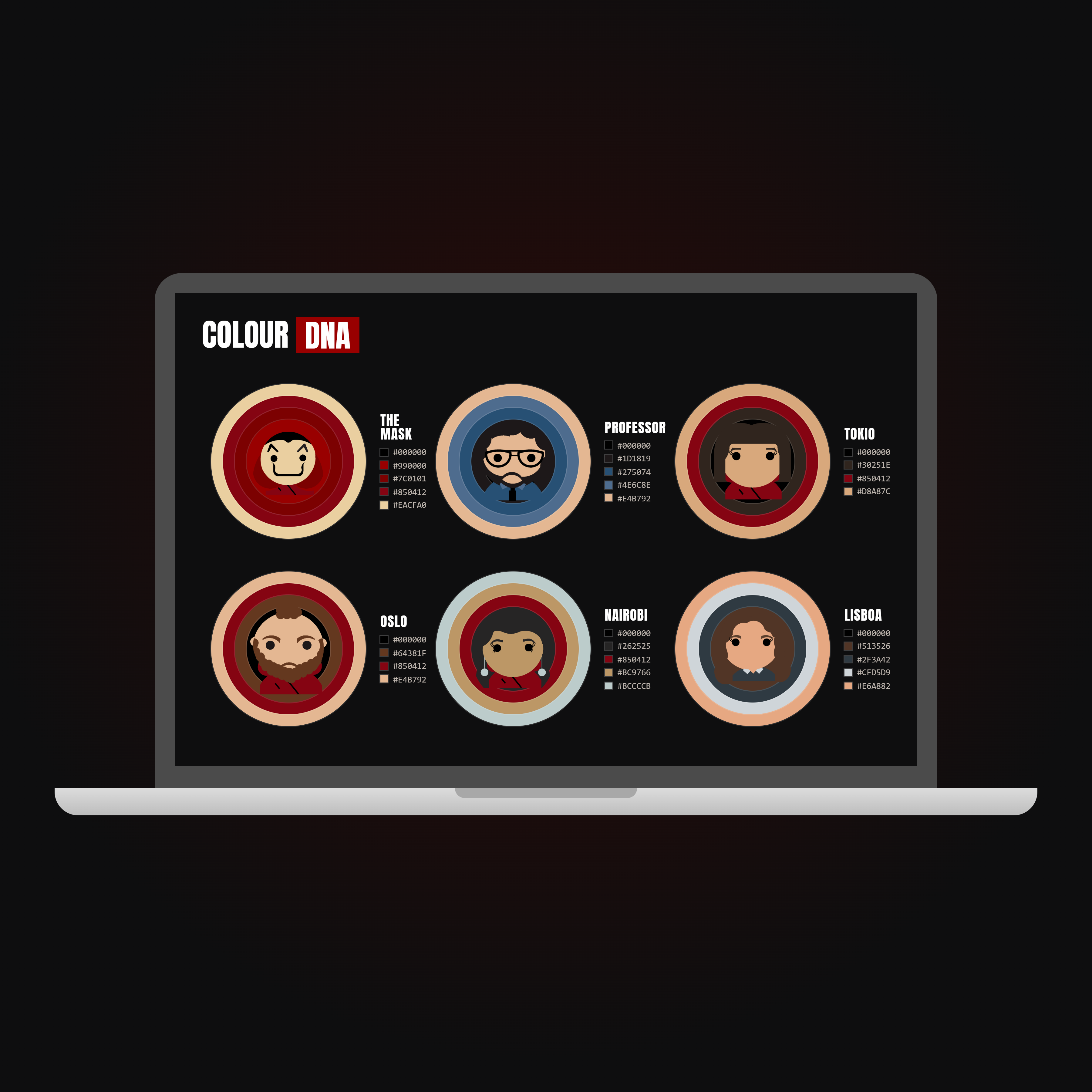
Red jumpsuits, white masks. The series hands you a palette strong enough to do half the identifying — the icons only have to use it honestly.
Testing & iteration
04Icons get tested at the size they'll actually be used, not the size they're drawn. Anything that survives shrinking to a favicon and still reads as the right character stays. Everything else gets simplified until it does.
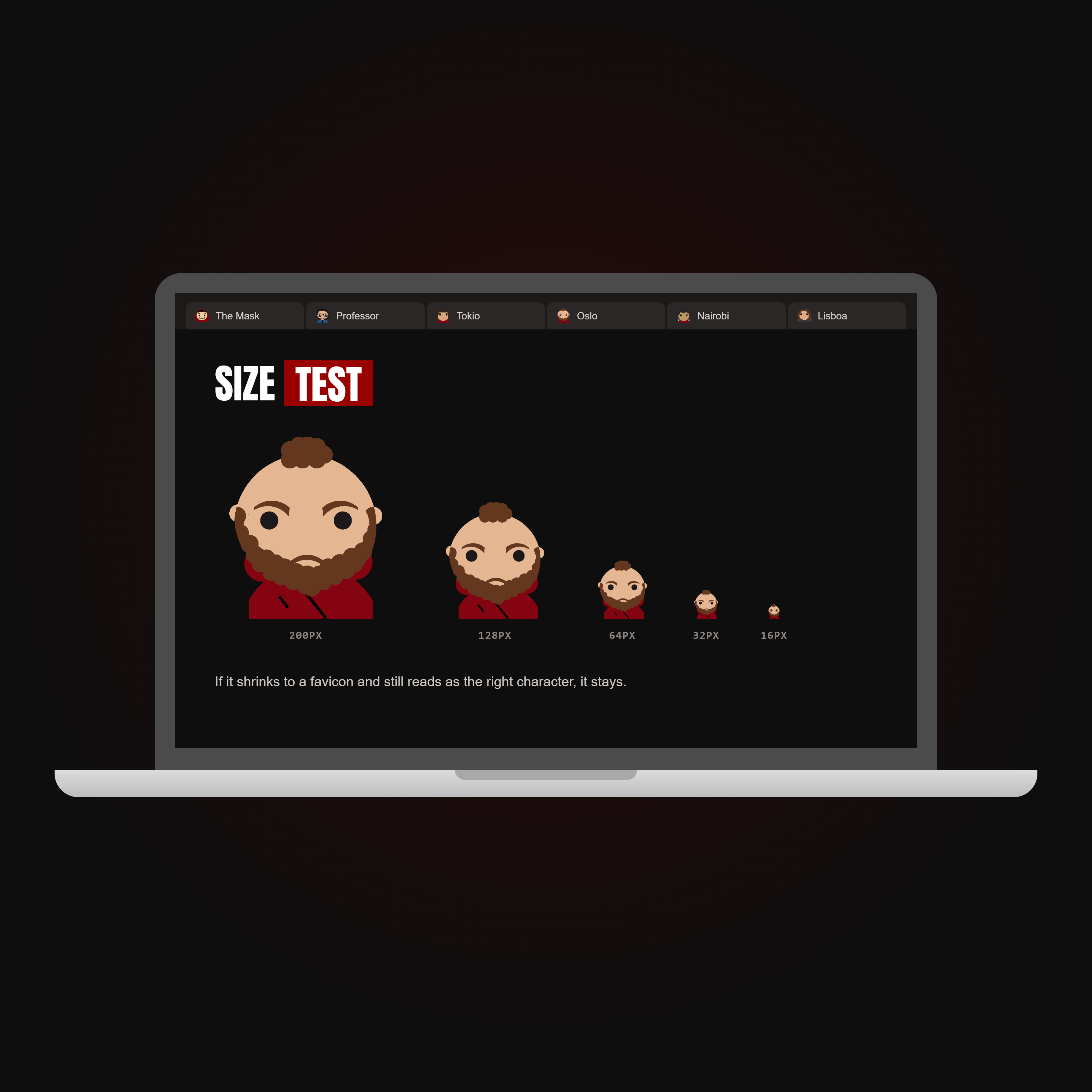
Each icon was shrunk from 200px down to a 16px browser favicon. If Oslo was still recognisably Oslo at the smallest size, the design stayed. If not, it went back for simpler shapes and stronger contrast.
I built the golden-ratio grid before the first icon, because it was defensible.
Two of the characters would read better with those proportions broken — the mask needs more width than the construction allows. I would draw three icons freehand, find where the family resemblance actually lives, and only then write the grid that protects it.